Logo design, brand and identity design
The Spinning Fix
A bike fitter and physiotherapist helping cyclists perform at their peak. An identity that explains a niche offering through iconography and type.
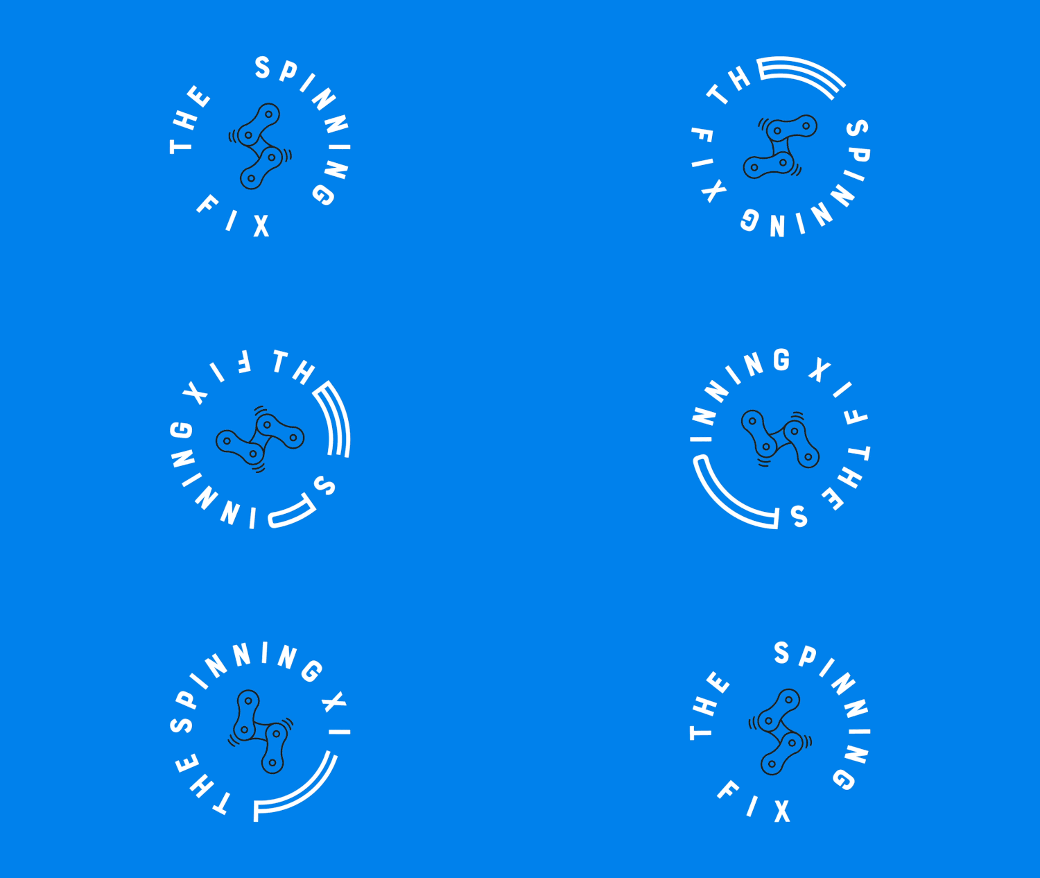
The Work
01 · Context
A niche offering, explained through type and icon.
Bike fitter and physiotherapist Richard White, combines his deep knowledge and skillset in the realm of physiotherapy with his passion for cycling. A unique, niche business has emerged – assisting cyclists to perform at their peak and steer clear of, or overcome injuries.
02 · The task
Attract a niche market, explain the offering.
Develop a brand identity that will attract this niche market, whilst visually explaining the unique offering through iconography and typography.
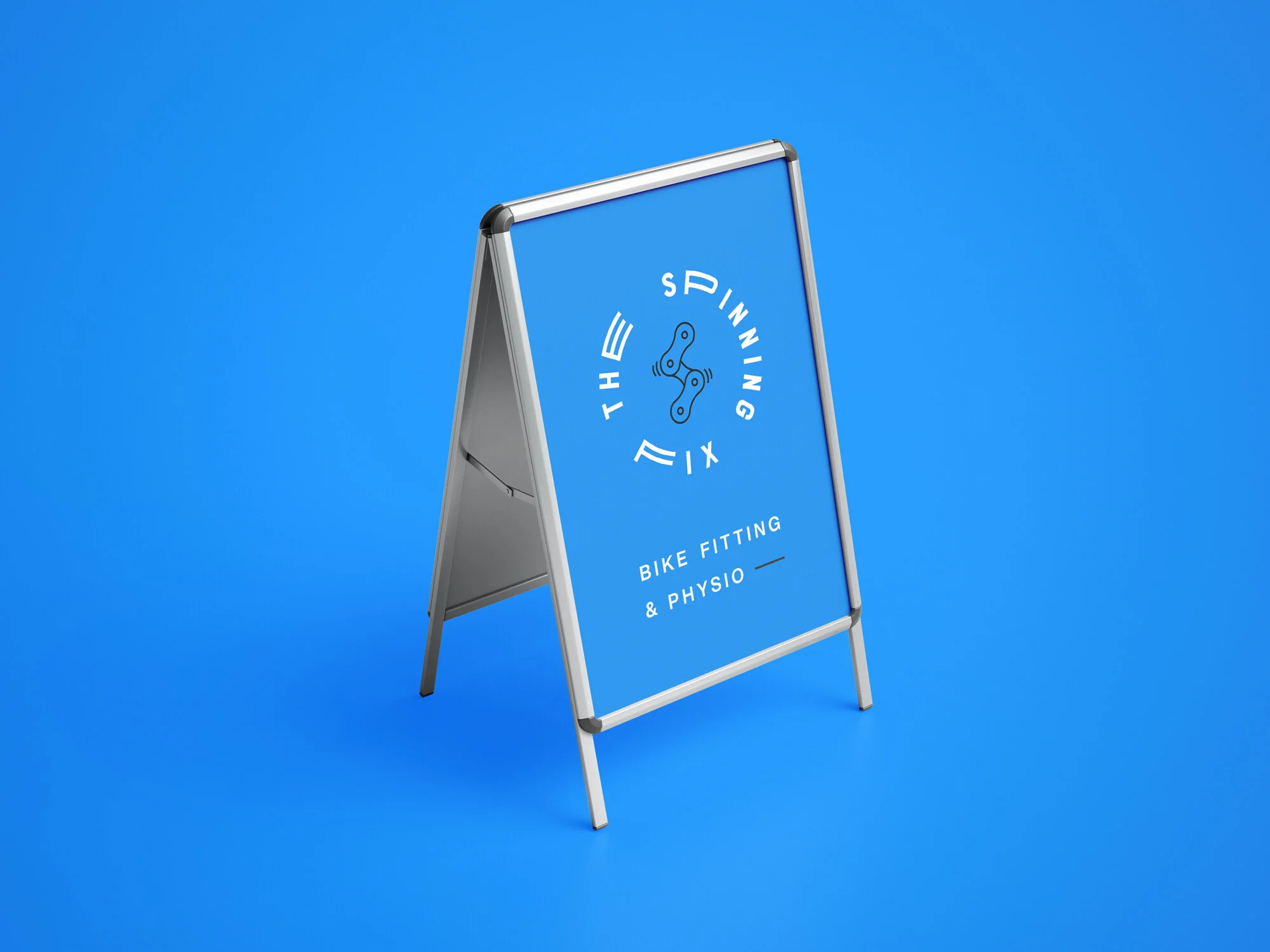
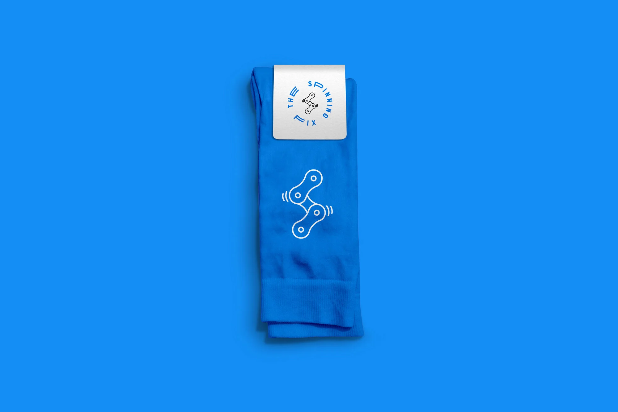
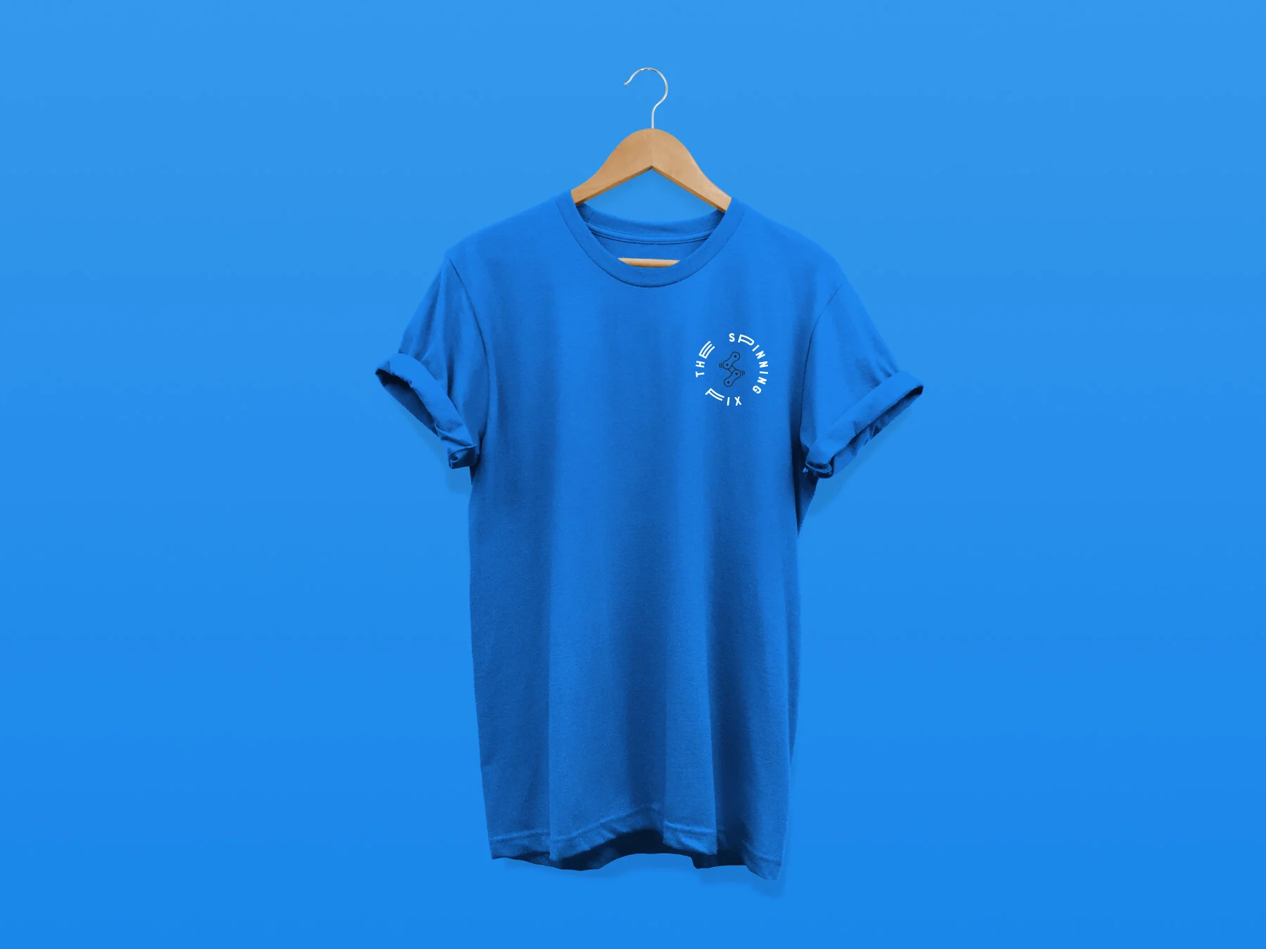
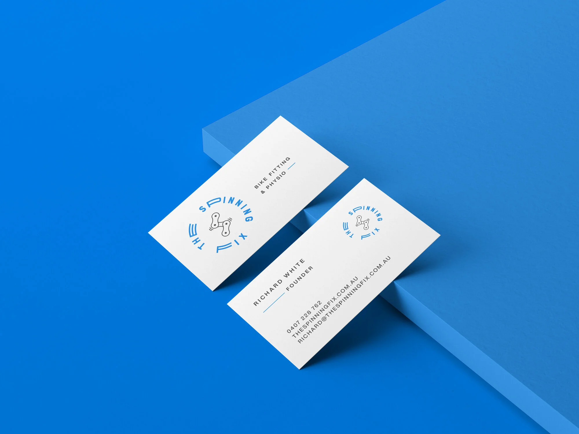
A chain-link monogram set in a circular lockup, carried across signage, apparel and stationery.

Scope
Logo design
Brand & identity design
Client
Richard White
Founder of The Spinning Fix
Task
Develop a brand identity that will attract this niche market, whilst visually explaining the unique offering through iconography and typography.
Related projects
Where to next?
FEELING THIS?
Let’s make your next move count.
Have a brand to build, a website to rethink or an idea that needs shaping? Tell me where you’re at and we’ll work out what comes next.