All Work

All 16Brand Web Print Motion
Nothing in this discipline yet.
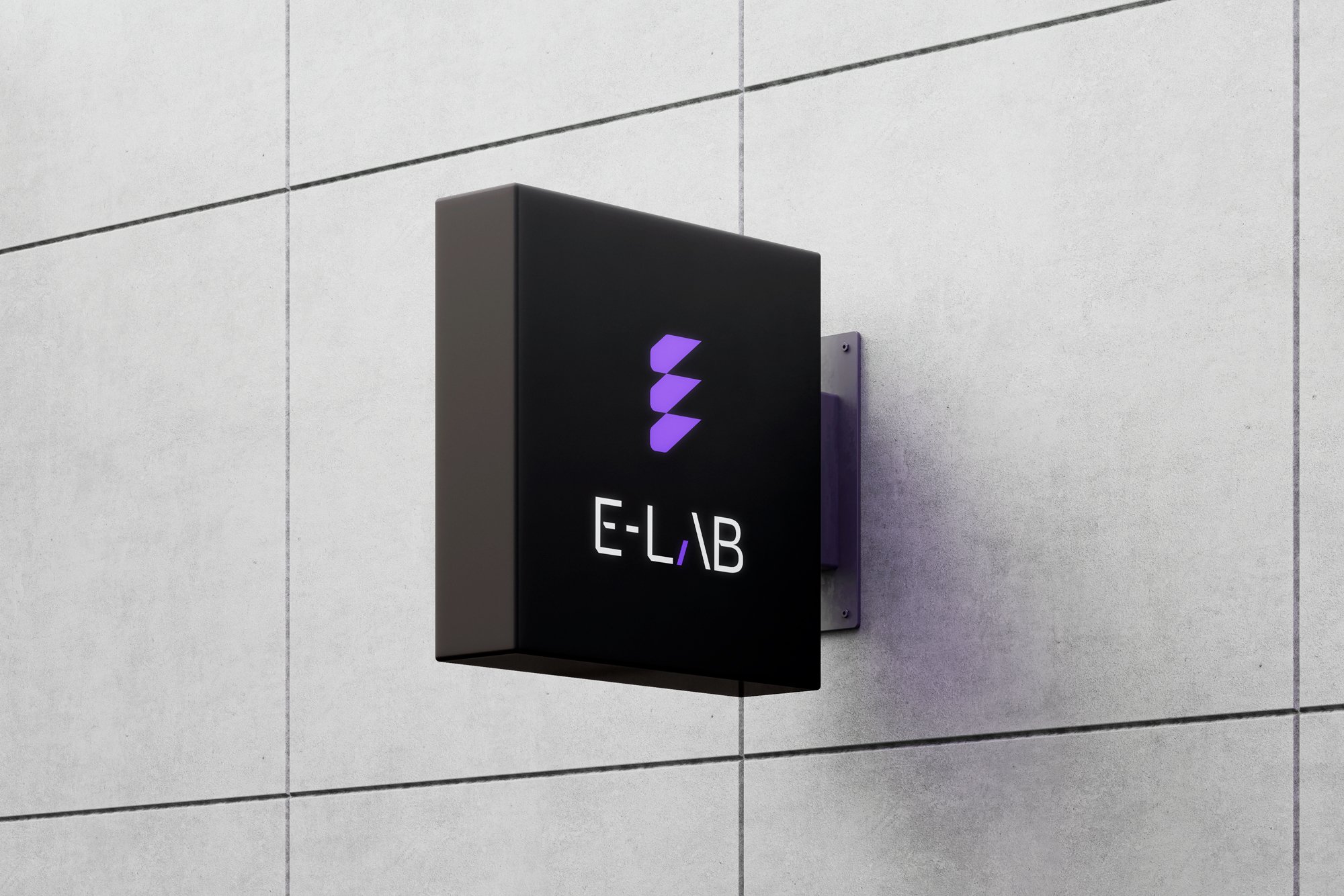
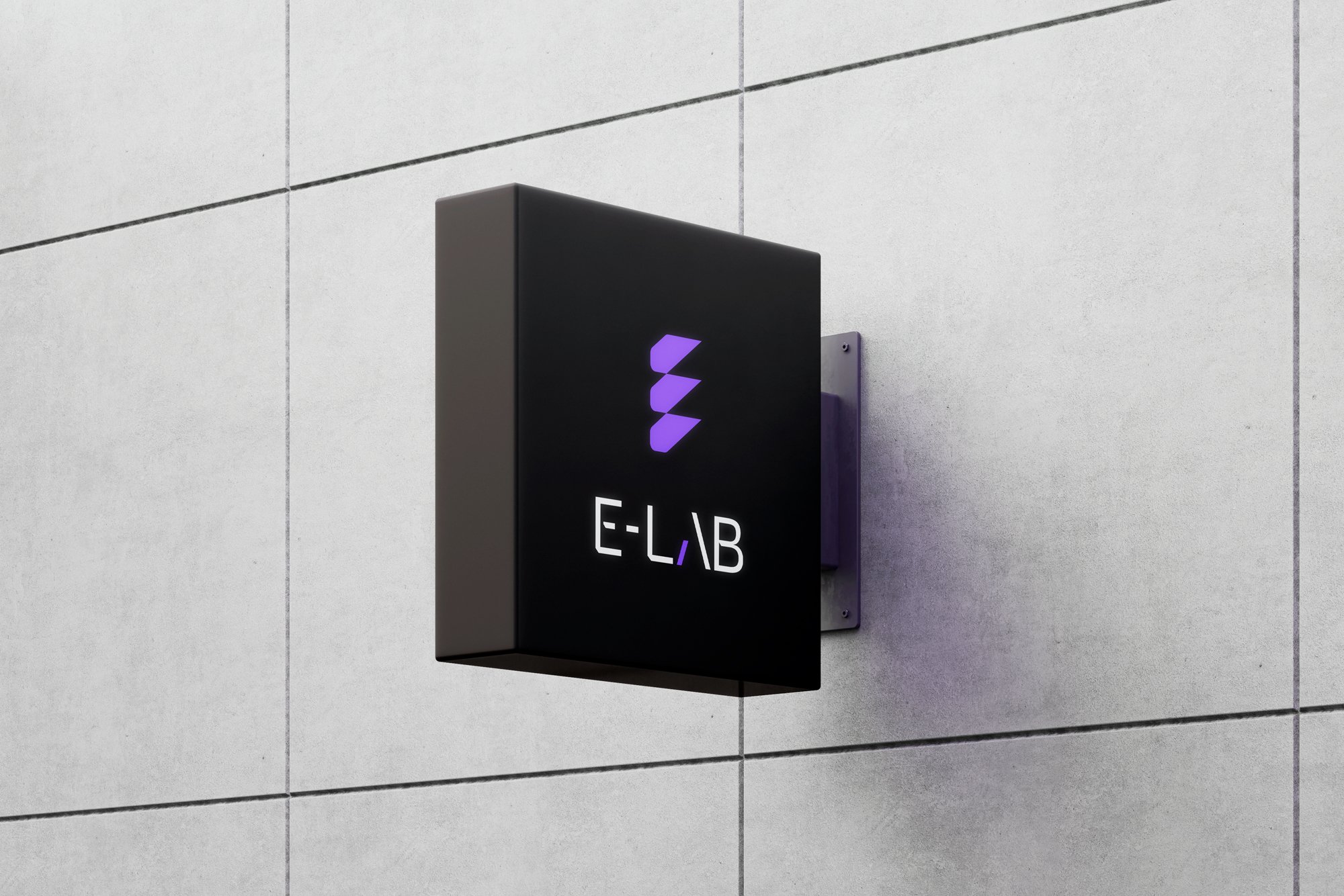
E-LAB square sign with the geometric E mark

E-LAB

Brand identity, guidelines, Webflow website and CMS, collateral

A specialist engineering consultancy working across the built environment. The identity began with a single geometric form: an E built as a structural module that stacks, repeats and connects. Read the case study
STILL

STILL

Product design, brand, Chrome extension

A Chrome extension that removes the feed and keeps the function. Social feeds, Marketplace and chosen websites get a moment of friction between impulse and action.

Read the case study
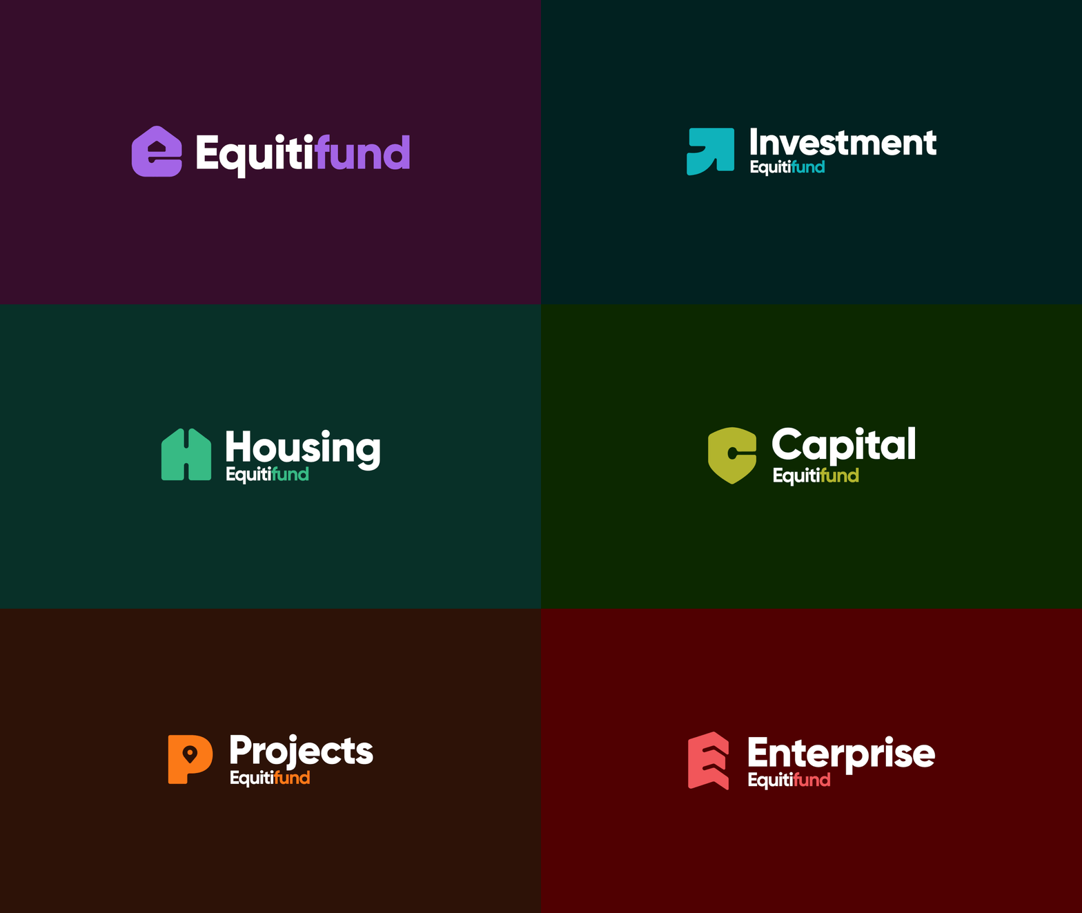
Equitifund

Equitifund

Masterbrand and sub-brand identity system, motion, guidelines

One masterbrand across housing, investment, credit, projects and enterprise. Distinction for each part of the business without fragmentation.

Read the case study
E-LAB

E-LAB

Brand identity, guidelines, Webflow website and CMS, collateral

A specialist engineering consultancy working across the built environment. The identity began with a single geometric form: an E built as a structural module that stacks, repeats and connects.

Read the case study
Game

Game

Brand identity, packaging, marketing materials. Client: Jack Warwick, Only Everything

A card game about drinking and discovering too much about your mates. Playful and eye-catching, from the logo to the box, cards and instructions.

Read the case study
Revelwell

Revelwell

Logo design, brand and identity design

An online fitness and wellbeing service. The R is a figure on a bike: premium yet simple, approachable and clear.

Read the case study
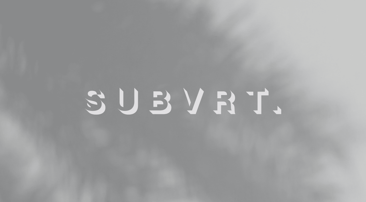
SUBVRT.

SUBVRT.

Brand and identity design, website design

An Asia Pacific events company creating brand experiences and live events. A rebrand built on unconventional thinking: Helvetica Neue turned on its head, with an underlying shadow that breaks the rules.

Read the case study
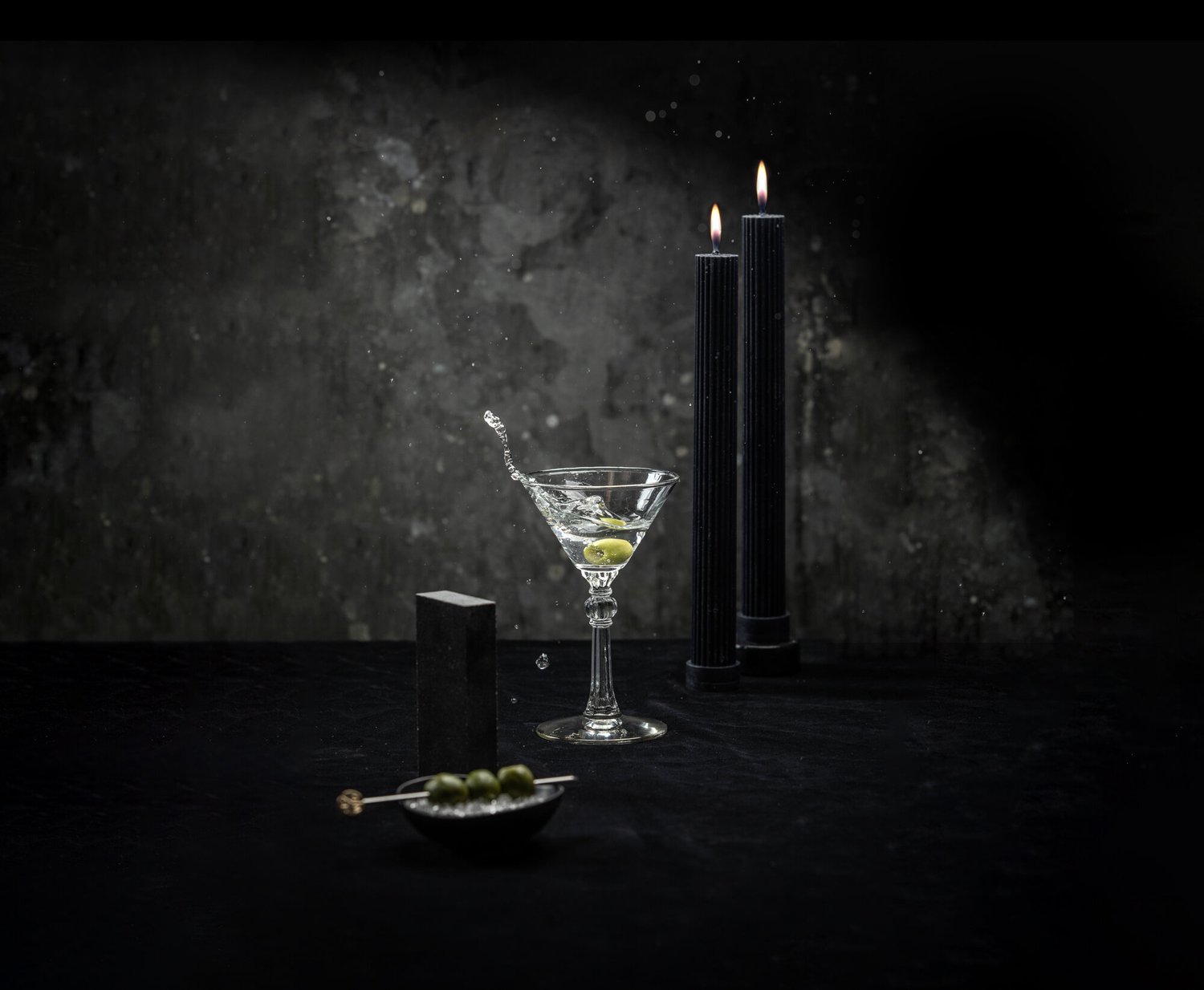
Ruby Wednesday

Ruby Wednesday

Art direction, graphic design, photography, website design.

A hand-crafted gin distilled near Cronulla Beach. The brief: capture its 1920s past with a modern twist, through photography and its online presence.

Read the case study
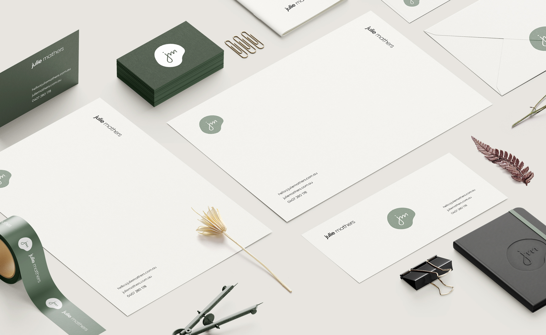
Julie Mathers

Julie Mathers

Brand identity, stationery, website design

A personal brand for the founder of Flora & Fauna, Australia's largest eco store. Typographic, warm and carried through stationery and web.

Read the case study
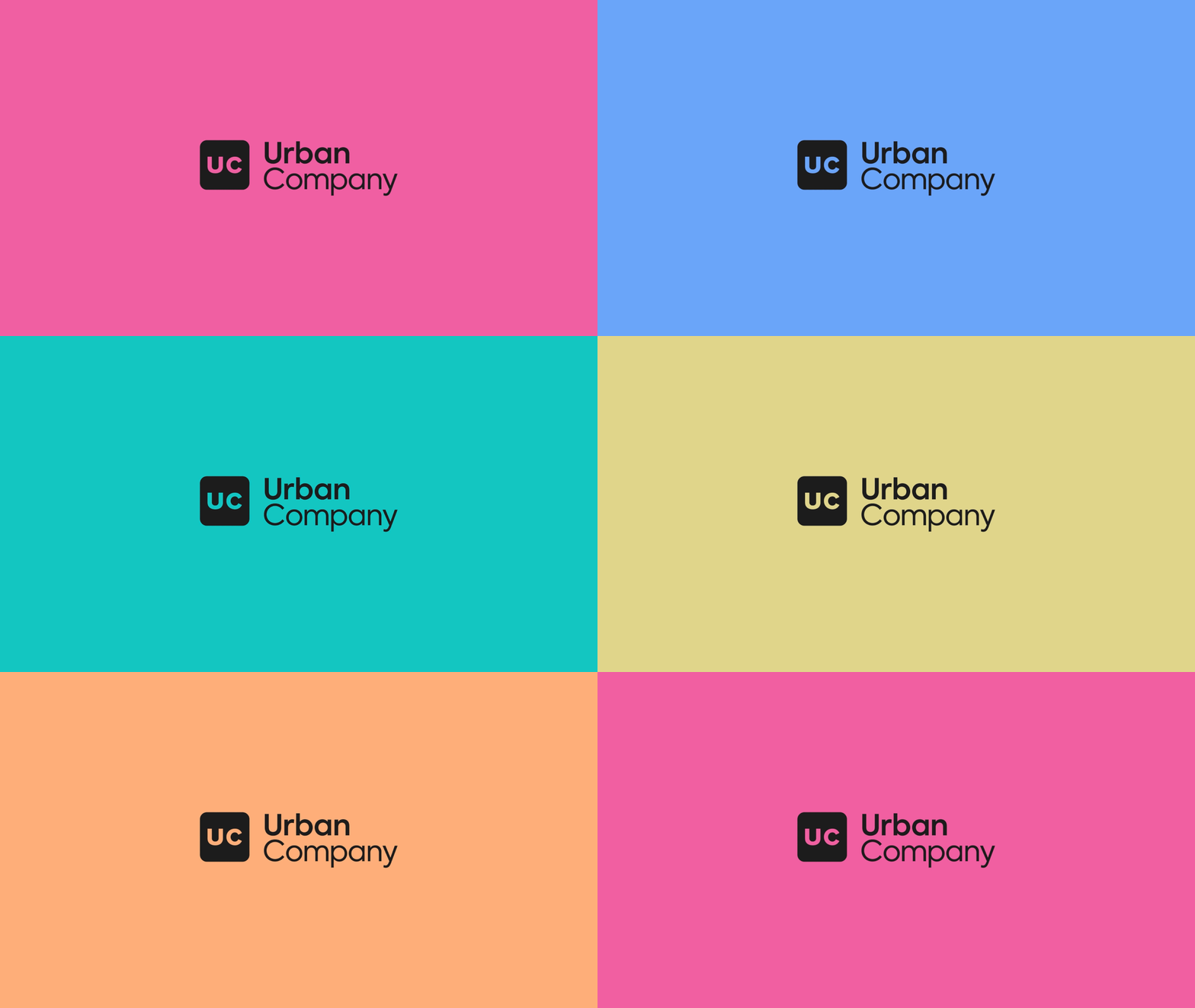
Urban Company

Urban Company

Brand refresh, art direction, photography, app and web UI

A new visual identity direction, art-directed photography and a user-friendly interface for the app.

Read the case study
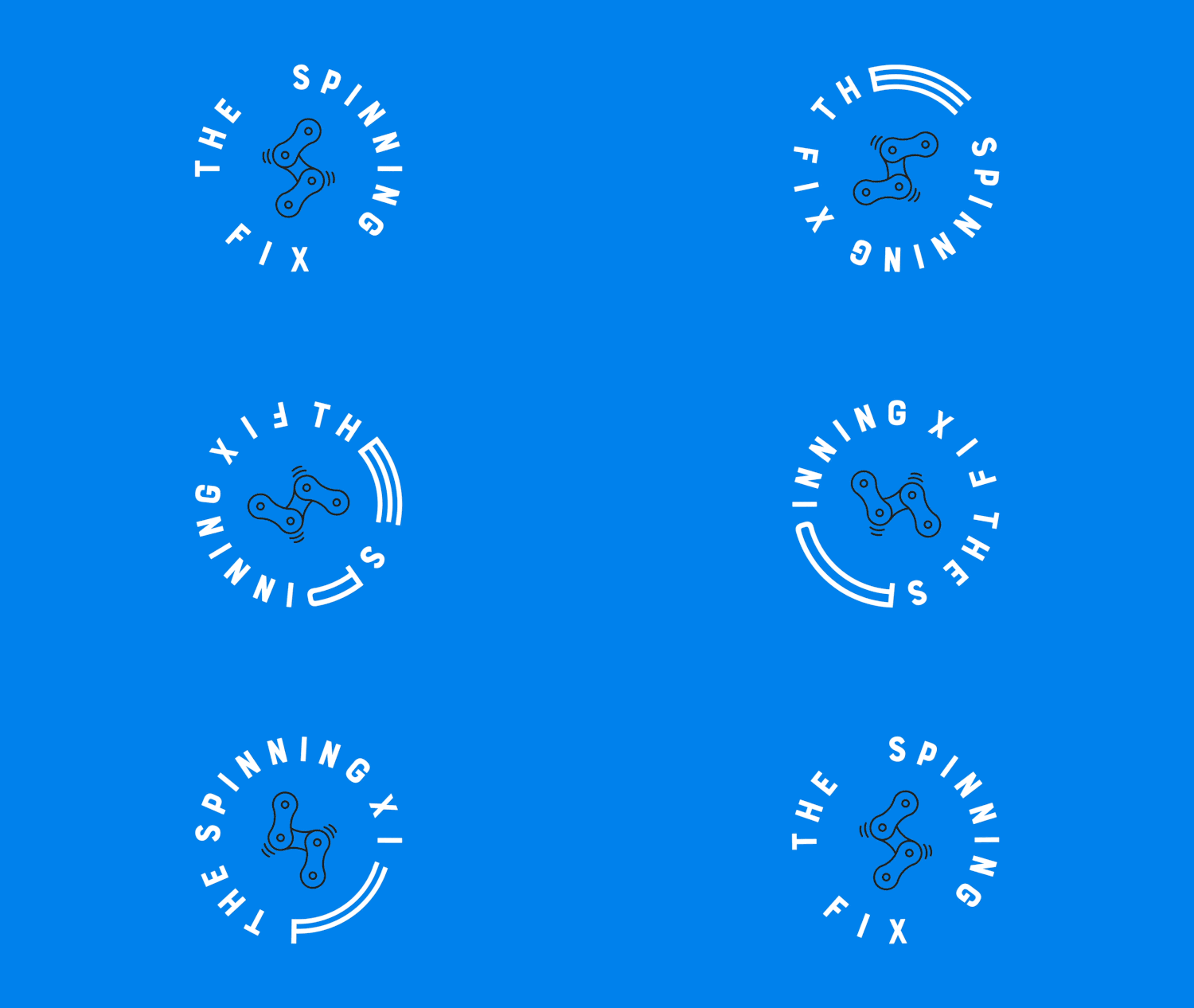
The Spinning Fix

The Spinning Fix

Logo design, brand and identity design

A bike fitter and physiotherapist helping cyclists perform at their peak. An identity that explains a niche offering through iconography and type.

Read the case study
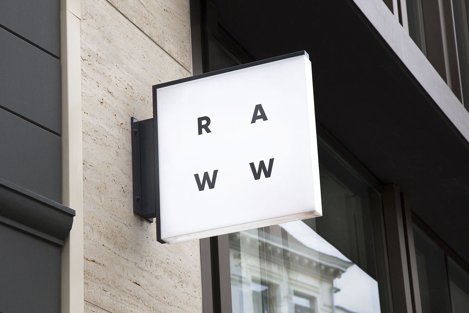
Raww Store

Raww Store

Brand and identity, packaging, copywriting, art direction, photography, e-commerce website

An ethical eco-friendly store offering alternatives to plastics. A minimal identity built to adapt across three areas of the business, reusable like the products.

Read the case study
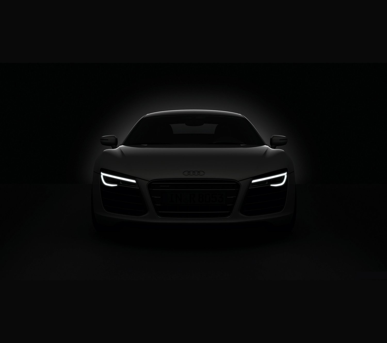
Audi R8 Blink

Audi R8 Blink

Design direction, UI design. Client: Audi Australia

An interactive WebGL film with webcam eye-tracking that counted every blink. Spikes Asia Bronze, FWA of the Day, Webby People’s Voice runner-up.

Read the case study
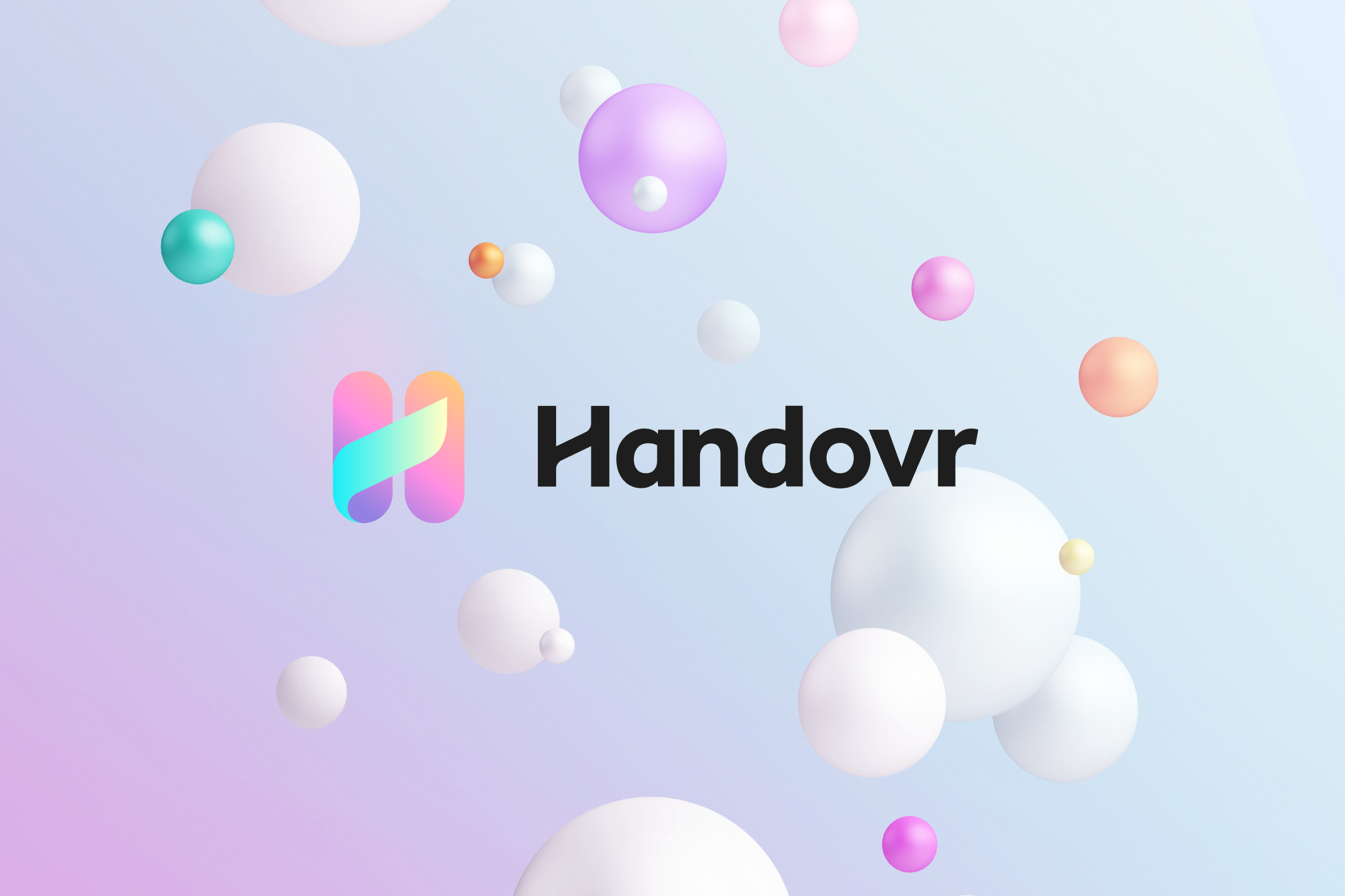
Handovr

Handovr

Brand identity, logo and monogram, 3D

Built to make the often messy relationship between product managers and software teams a whole lot smoother. A bold identity, clear voice and digital home that made a technical product feel simple, useful and human.

Read the case study
DD x MM

DD x MM

Artwork collaboration with Marisa Mu

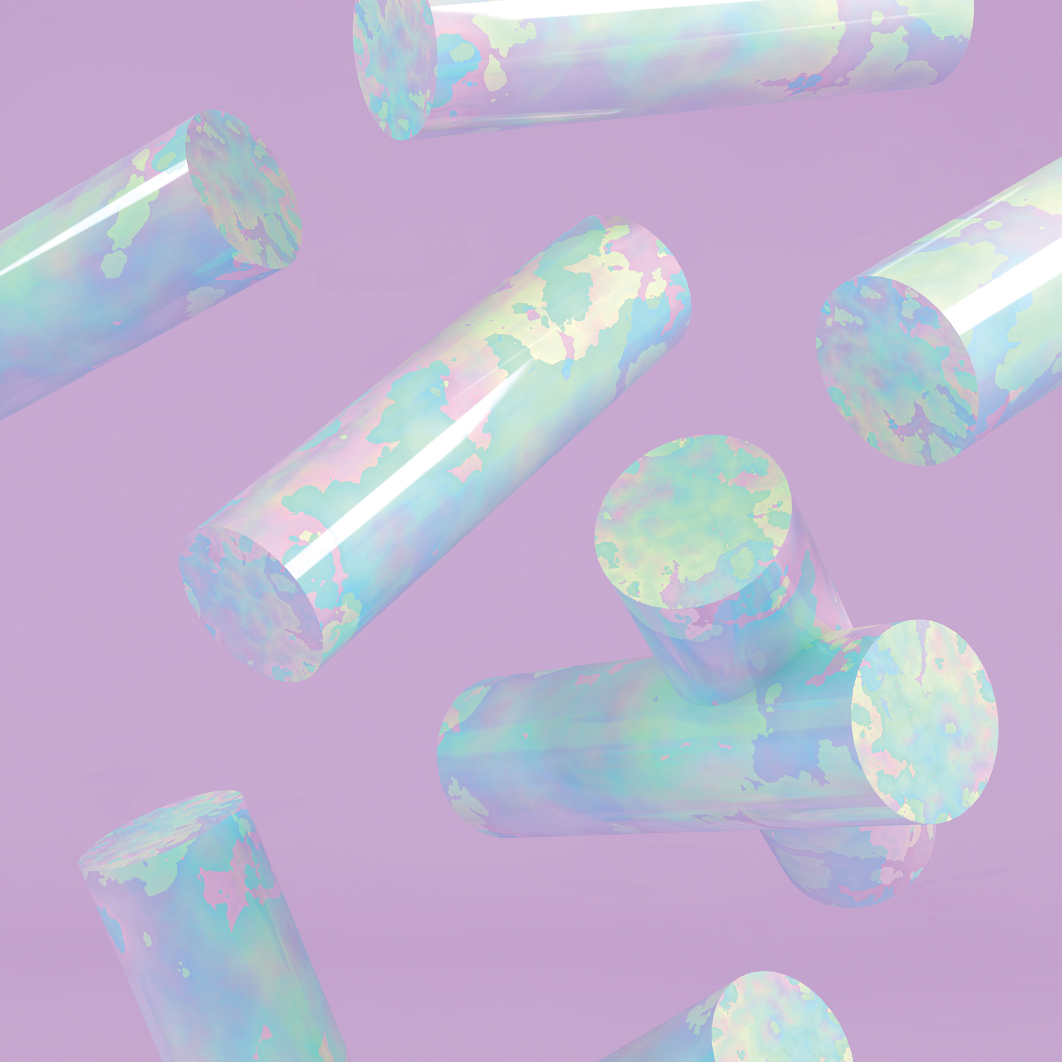
Bespoke artworks for a collection of leather goods: pastel tones, dreamscapes and considered shapes. Pastel Haze and Cylinder Beach, the first of many.

Read the case study
Zimmermann

Zimmermann

E-commerce website, UI design for desktop and mobile

An Australian luxury fashion brand. An e-commerce experience built to stand out from the competition and reflect the reputation Zimmermann holds.

Read the case study
The Latch

The Latch

Brand and identity design, website design. Client: Val Morgan

A beauty, wellness and entertainment title that wanted to look gender-neutral, grown-up and considered. A refresh so the brand reflects the content, with a website built to carry it through its formative years.

Read the case study

Has your business outgrown its brand?

Tell me a little about where the business is and what you want to change. I’ll come back to you personally.

Or email drew@dd-design.com.au

Thank you! Your submission has been received!
Oops! Something went wrong while submitting the form.